

|
醫學會(前身稱香港中華醫學會)早期的會徽圖案簡單,由兩條毒蛇盤繞一根牧杖,這是古時醫療專業的典型徽章。
|
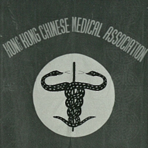 The early emblem of the HKMA (which was known as the Hong Kong Chinese Medical Association) was a simple design - the representations of two serpents curled around a staff device which is a typical Latin symbol of medicine.
|
In 1973, the HKMA had received unfavourable offerings from drug firms to make key-chains or other articles bearing the HKMA logo. In order to prevent other people from using the Association Crest, the Association decided to take our Hon. Legal Adviser's suggestions to register it as a trademark. However, owing to the close resemblance of the Crest to the emblem of the British Medical Association at that time, a new design was needed. This started the search for the perfect emblem of the HKMA.
|
 After the Association changed its name in 1970 to the Hong Kong Medical Association, a new emblem was adopted. It consisted of a shield in the centre which also bore a rod entwined by two serpents (Staff of Aescupalius). On top of the shield is a purplish crest bearing 5 petals, representing Bauhinia blakeana, the flower of Hong Kong. Circumventing the shield were two fleams (the Laurel), an ancient symbol of medical surgery in heraldic art.
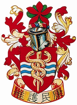
In 1974, the Association applied to the College of Arms in the United Kingdom for the design of a brand new crest. The Association Crest which we now adopt was finally born at the end of the same year. The emblem consists of,
1. Shield of Arms
2. Helm, Mantling and Crest
3. Motto Scroll
There are two major characteristics of the emblem:
1. Shield
A Fess barry wavy Argent and Azure was added to the shield to distinguish it from other Arms already on the Register of the College of Arms. This is also an heraldic way of representing waves and the sea, symbolizing Hong Kong's maritime location which gives it such importance.
2. Motto
The Chinese motto "維護民康", meaning safeguarding public's health, was the brilliant idea of our Past President for the year 1952-53, the late Dr. Pang Hock Koo. The official English translation was "Guardian of Health" and unknown to many members, there is also a Latin version, namely "Civium sanitatem servare", which means "to maintain (or protect) the health of the people". Owing to lack of space, only the Chinese motto is put on the scroll.
In March 1976, the Letters Patent of Armorial Bearings of the Hong Kong Medical Association have been completed in every aspect and from that time onwards, the Association is free to use its emblem in all publications.
1970年中華醫學會更名為香港醫學會後,採納了新會徽。會徽中心是一個盾牌,盾牌上亦有兩條毒蛇盤繞一根牧杖(醫神的牧杖)。盾牌上方有5片花瓣,代表香港市花洋紫荊。盾牌周圍環繞著兩根放血針(桂冠),這在古代紋章藝術中象徵外科手術。
1973年,醫藥公司曾向醫學會提出在鑰匙鏈及其他物品上印製醫學會會徽,對醫學會產生不利影響。為防止其他人利用醫學會會徽,醫學會決定採納法律顧問的建議,將其註冊為商標。但由於當時的圖案與英國醫學會會徽相似,因此需要重新設計,於是醫學會開始徵集完美的會徽。
1974年,醫學會向英國紋章院 (College of Arms) 申請新會徽設計,當年年底,我們現在採用的會徽終於誕生了。新會徽的圖案包括:
1. 盾牌
2. 舵、斗篷及錦冠
3. 箴言條
這個會徽有兩大特點:
1.盾牌
盾牌的中央添加了銀色及天藍色的波浪線,以區別於已在紋章院註冊的盾形紋章。這在紋章學上代表波浪及大海,象徵香港舉足輕重的港口地理位置。
2.箴言
「維護民康」意為維護公眾的健康。這是我們已故的前主席 (1952-53) 彭學高醫生提出的崇高理念。箴言的正式英文翻譯為「Guardian of Health」,許多會員並不知曉這條箴言亦有拉丁語版本「Civium sanitatem servare」。由於空間有限,箴言條上僅包括中文箴言。
1976年,香港醫學會的紋章專利全部完成,此後,醫學會可以自由在所有刊物使用其會徽。